How to... create simple slides
Dark letters against a light background works well.
Light letters against a dark background also works well.

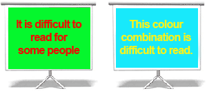
Do not choose red and green combinations.
Many people are colour blind and cannot see these colours.
Use the grey scale view on your toolbar to check there is enough contrast between the background and the colour of the typeface.
TIP: the colours look good on your computer?
CHECK: they look good when projected
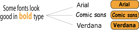
Choose Verdana, Arial, Tahoma. These are modern and easy to read.
Times New Roman or Courier are good for paper documents... but not so good on screen.
Titles and headings: 33 to 44 point

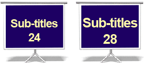
Sub-titles: 24 to 28 point, nothing smaller than 18 point
Look at your slide from the back of a room – can you still read it?
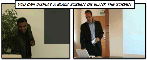
You want the audience to LISTEN to you so practise using these keys:
B = Black or white screen
Esc or B = back to presentation
")